Hella Hot

Hella Hot
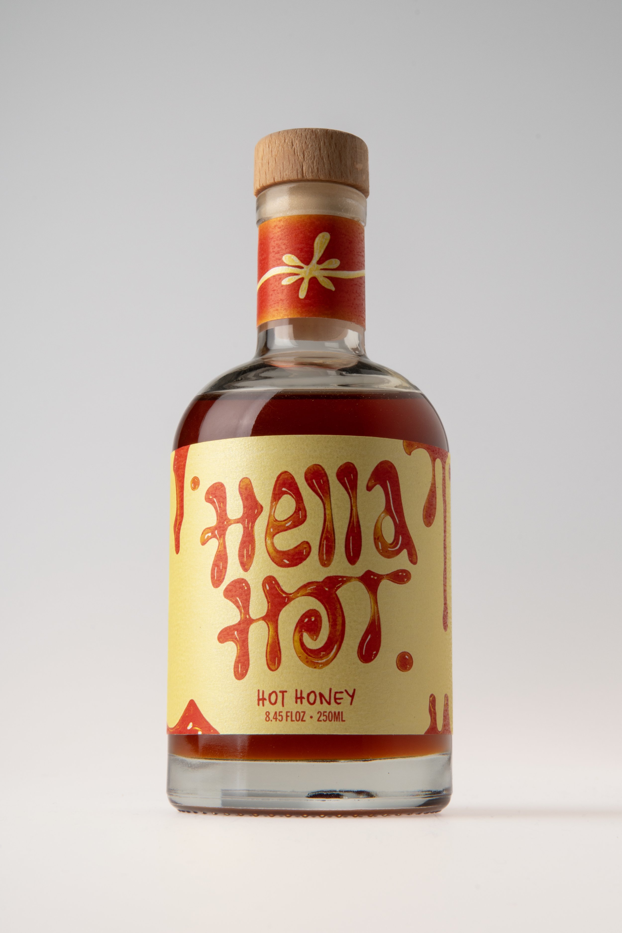
Hot honey infused with Calabrian chilies featuring bold typography inspired by Oakland’s street art.Label Design
Product Photography
TEAM
Solo Project
TOOLS
TIMELINE
Illustrator
Photoshop
5 weeks, 2025
SKILLS
Design Process
Moodboard
For Hella Hot, I pulled my inspirations from eye-catching condiment brands and Oakland’s street art archives. I wanted to capture the fluidity of spray paint drips and bring honey-like dimension to my typography through bright highlights.

To capture the essence of a hot honey drizzle through letterforms, I experimented with mixing the anatomy of the typefaces DX SLIGHT, ESTRELLA EARLY, and slap tag styles.
Hand Lettering

Product Sketches
I sketched the typeface mashups onto various bottles to visualize which container shape and typography style best captured the balance of sweet and heat.

Honey Typography
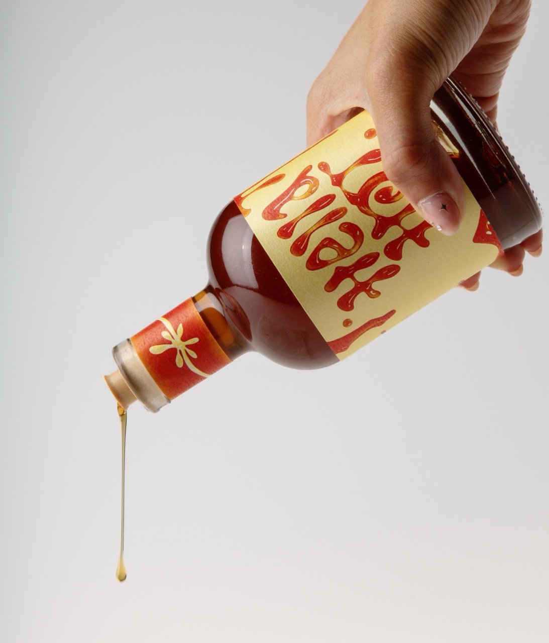
I wanted to incorporate highlights and depth into my designs to capture honey’s essence. Using a honey bottle, I began squeezing my custom typography. The honey only held its shape for about 30 seconds, so I had to snap photos fast!

Finished Product
Flat Label
Infused with Calabrian chilies, HELLA HOT pays tribute to my Italian heritage and hometown. My final design blends both backgrounds into a condiment that adds flavor to every drizzle. And it’s HELLA HOT!


Reflection…
The final design is bold, fun, and full of flavor—bringing together the heat, texture, and Bay Area energy I was aiming for. This summer, I’d love to photograph Hella Hot on store shelves!