Blue Oak
Blue Oak
Rebranding Cal Poly’s Leaning Pine Arboretum to promote horticulture education and community engagement
TEAM
TIMELINE
TOOLS
SKILLS
Photoshop
Figma
Interaction Design
PROJECT TASK
7 weeks, 2023
Solo Project
Marketing Strategy
Illustrator
Brand Identity
InDesign
Rebrand an existing business to elevate its brand identity and drive engagement with the target audience.
PROJECT GOAL
Redesign an existing brand to demonstrate proficiency in branding by creating a cohesive visual identity. Develop both print and digital consumer outreach initiatives.
⟡
RESULTS
I renamed the Leaning Pine Arboretum Blue Oak Horticulture Center to reference the native Blue Oaks of the Central Coast. The redesigned brand includes a fresh logo, promotional materials, and an interactive mobile app. The updated branding clarifies the center's educational purpose, connects visitors to the local environment, and expands the center’s appeal to a broader audience.
Brand Identity
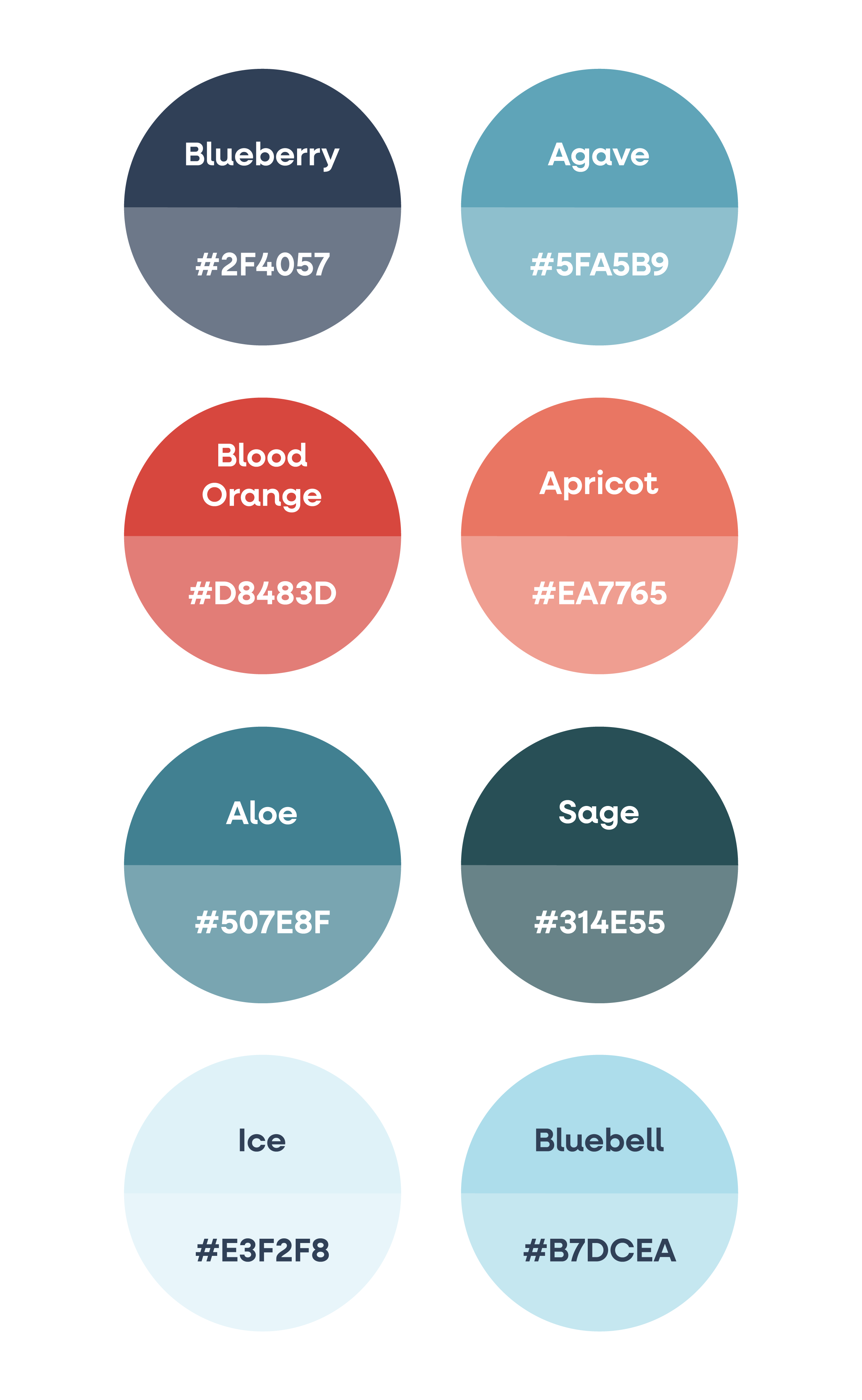
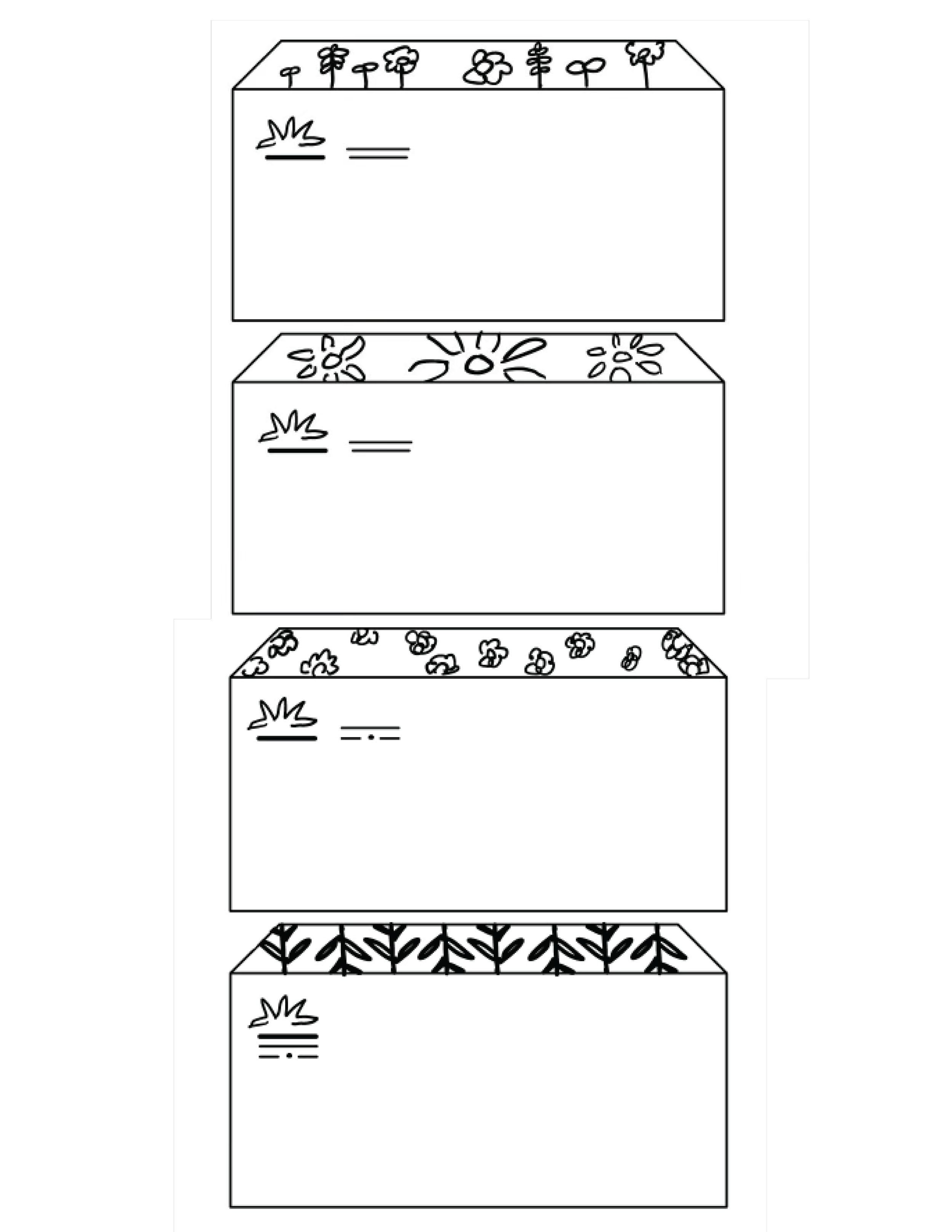
I created Blue Oak's color palette by drawing inspiration from the most common plants in the gardens. This ensured that the branding reflected the natural beauty of the lush gardens.
COLOR STUDIES

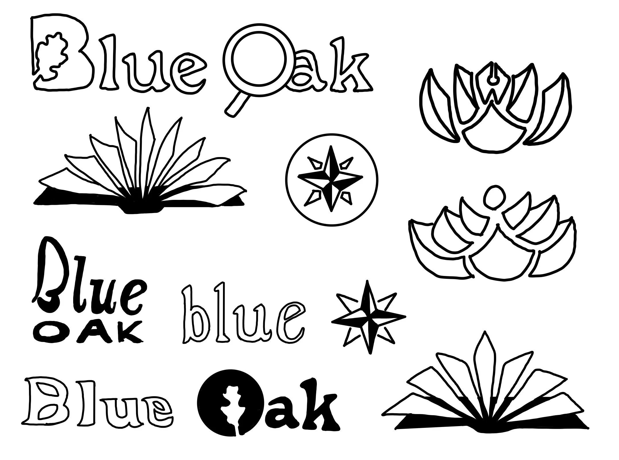
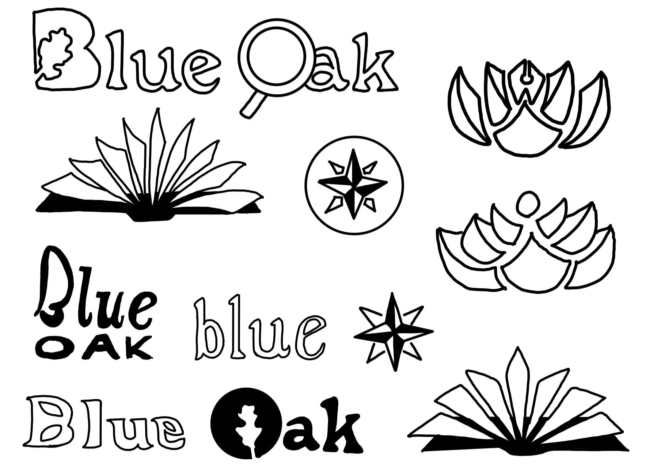
LOGO SKETCHES
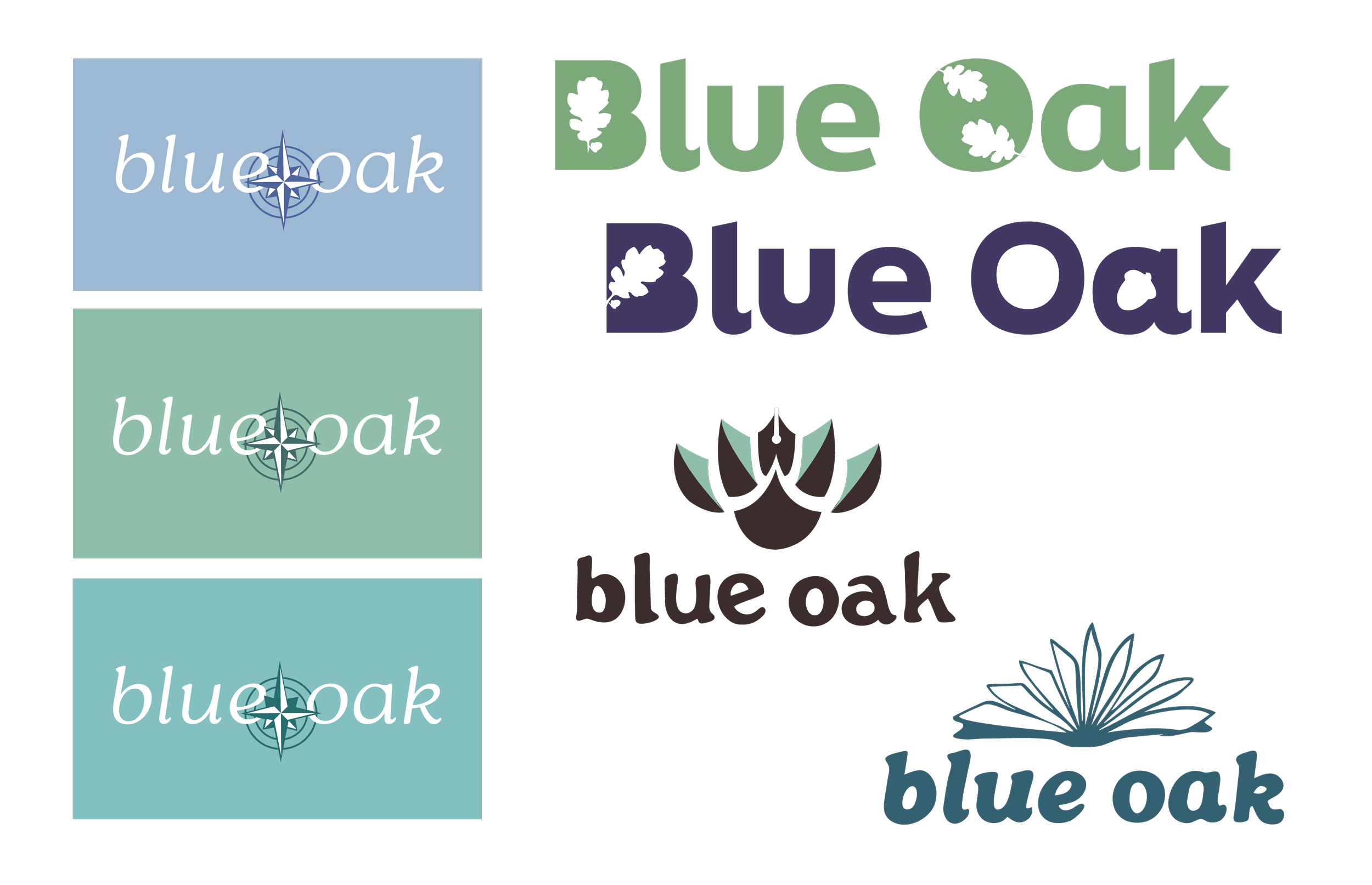
My initial logotype sketches explored the updated brand name and its letterforms, guiding the development of visual motifs for the final Blue Oak logotype design.
LOGO REFINEMENT
My first digital iterations refined the logotype letterforms and explored typographic treatments to emphasize the brand's connection to nature and educational mission.
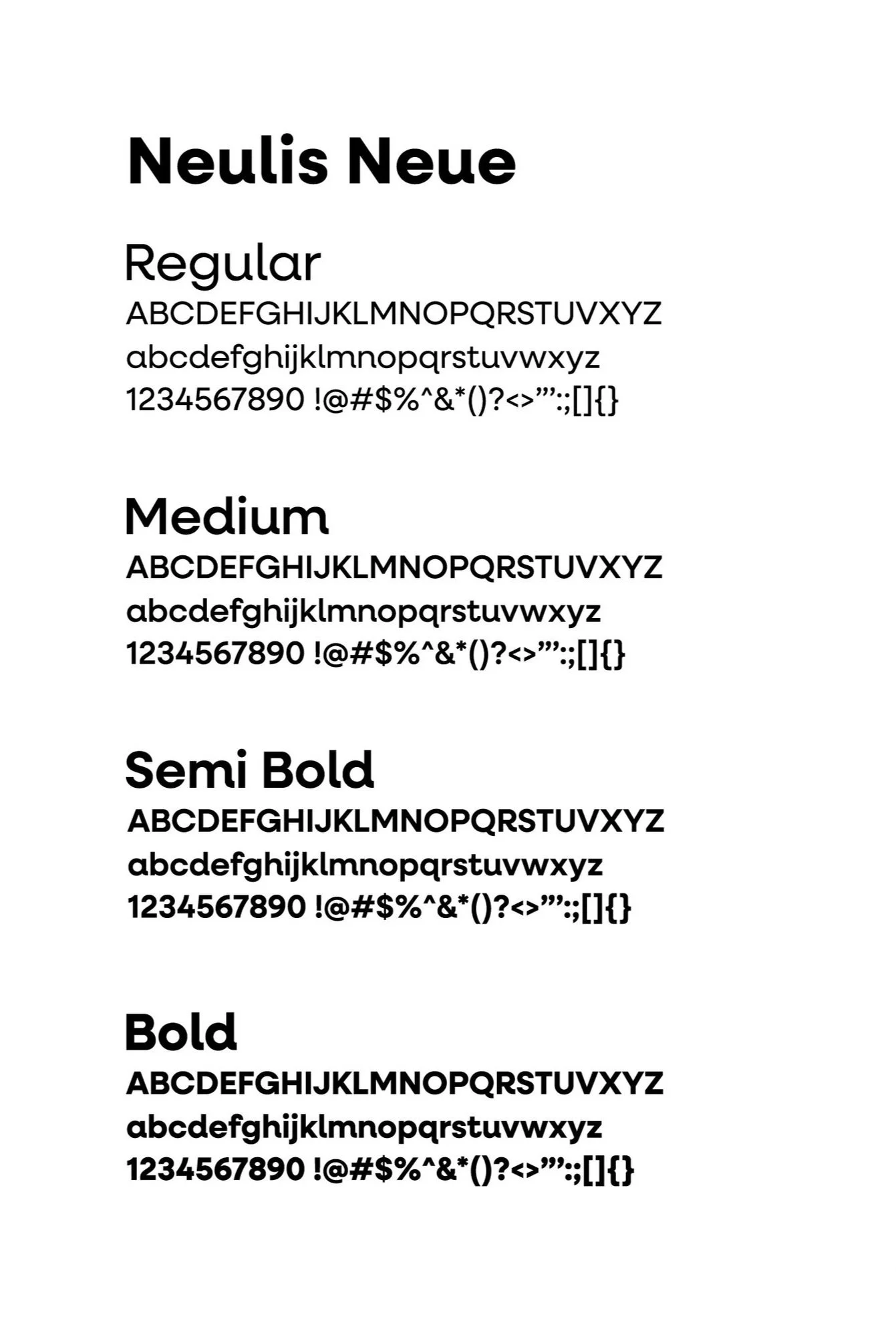
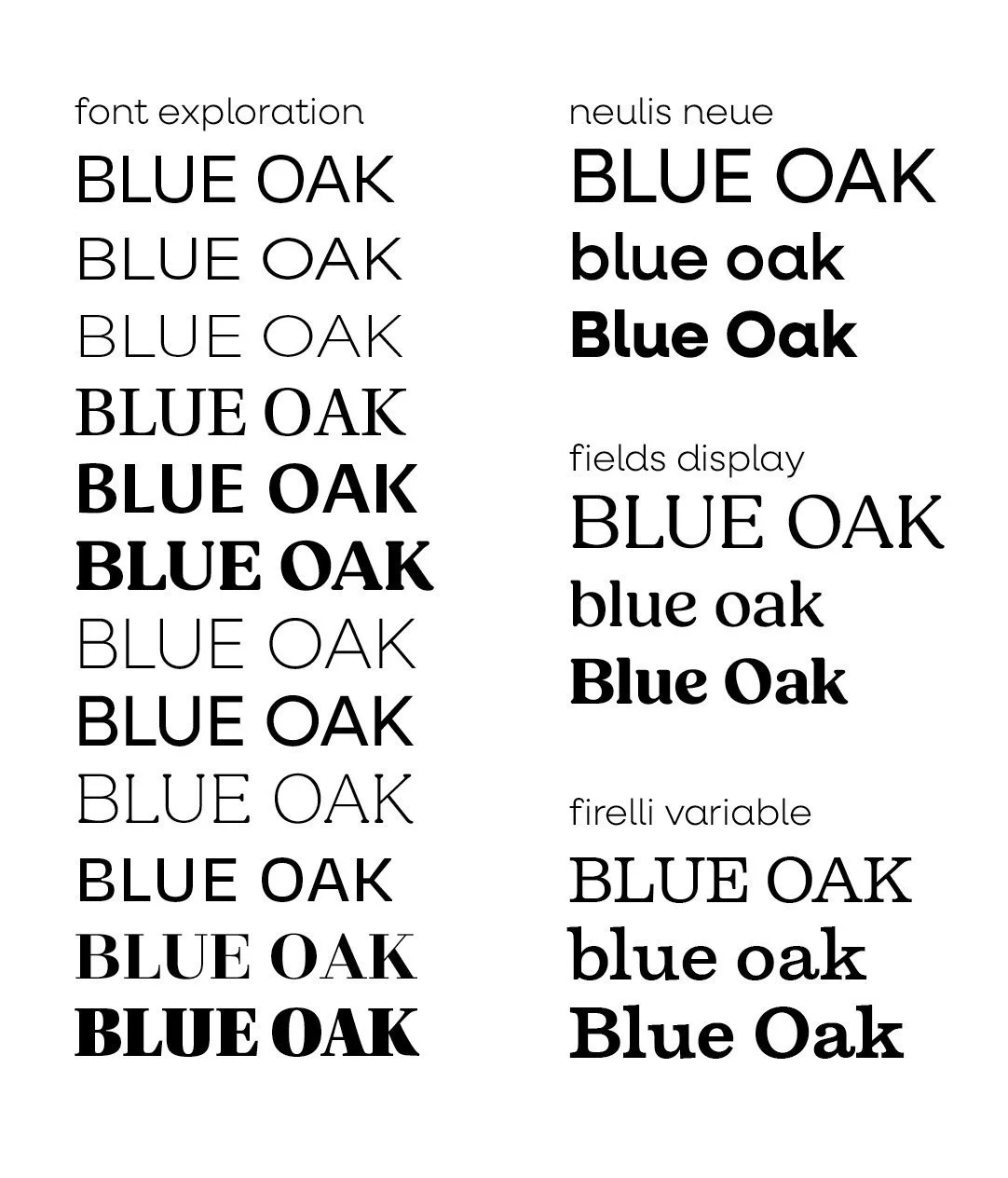
After exploring various typefaces, I chose Neulis Neue for its clean, sans-serif design and friendly, curved spurs. These elements aligned with my vision for Blue Oak's brand identity.
TYPE STUDIES

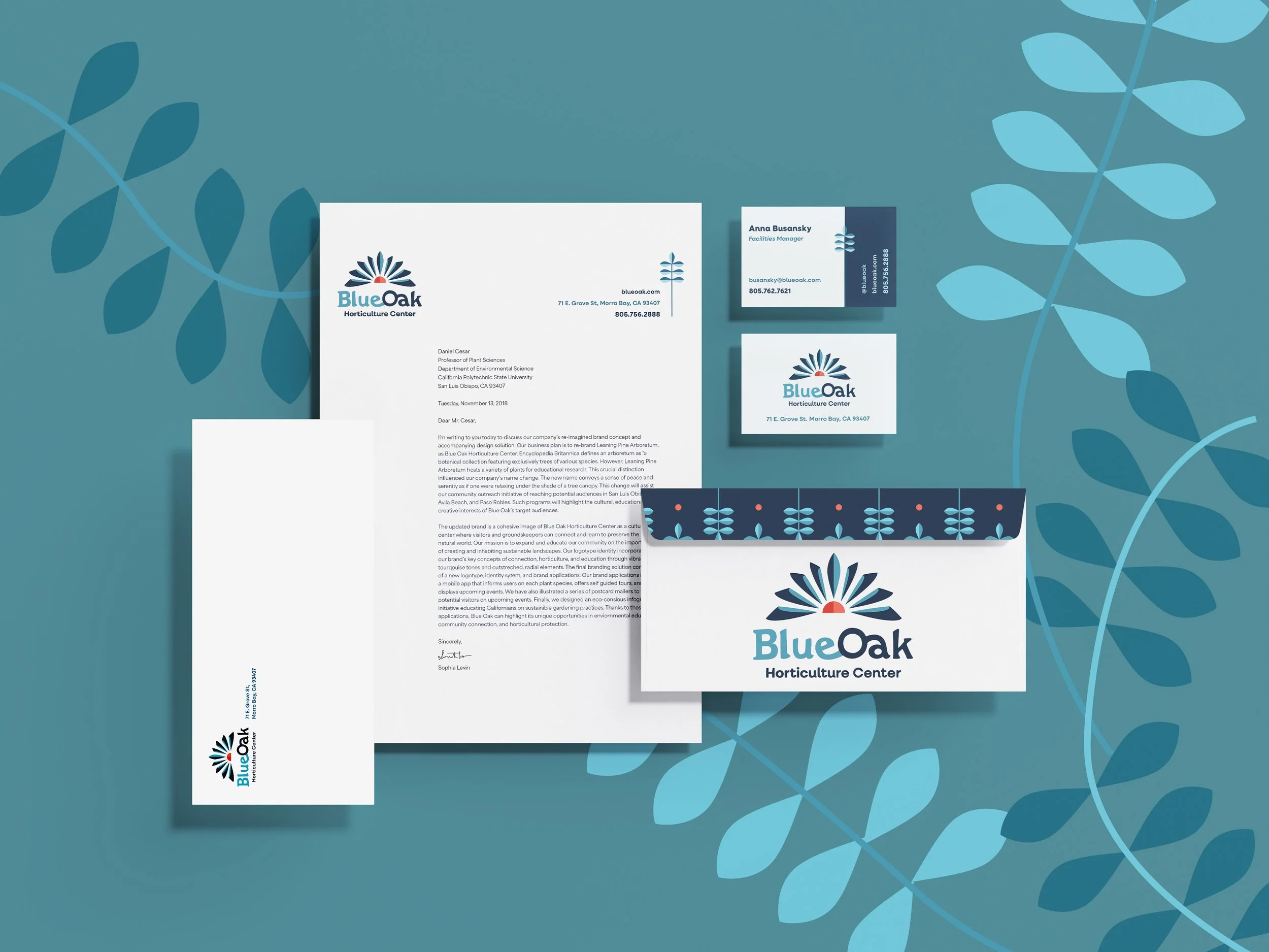
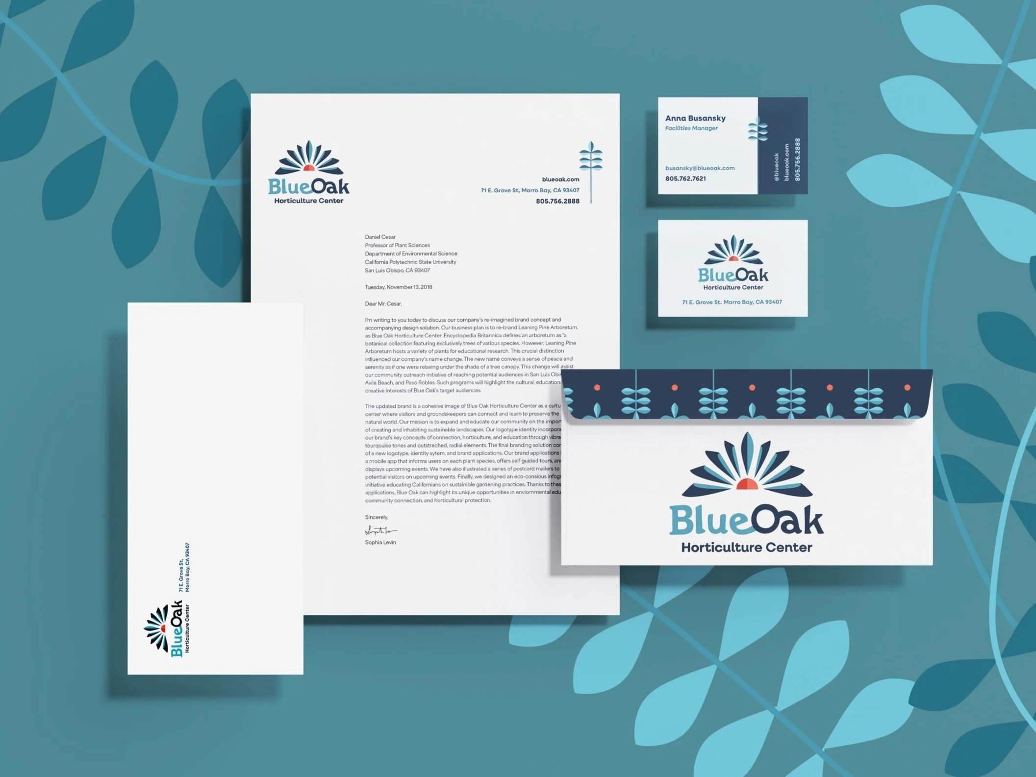
Blue Oak's brand identity symbolizes community and discovery through the connected letterforms 'e,' 'o,' and 'a.' The graphic logo features outstretched, radial elements that mimic the pages of an open book while referencing the agave plants commonly found in the gardens.
BRAND IDENTITY
Brand Collateral
I aimed to emulate the Memphis Group’s use of fun geometric connections while sketching ideas for how the chocolate shapes could interlock.
BUSINESS ITEMS
I aimed to emulate the Memphis Group’s use of fun geometric connections while sketching ideas for how the chocolate shapes could interlock.
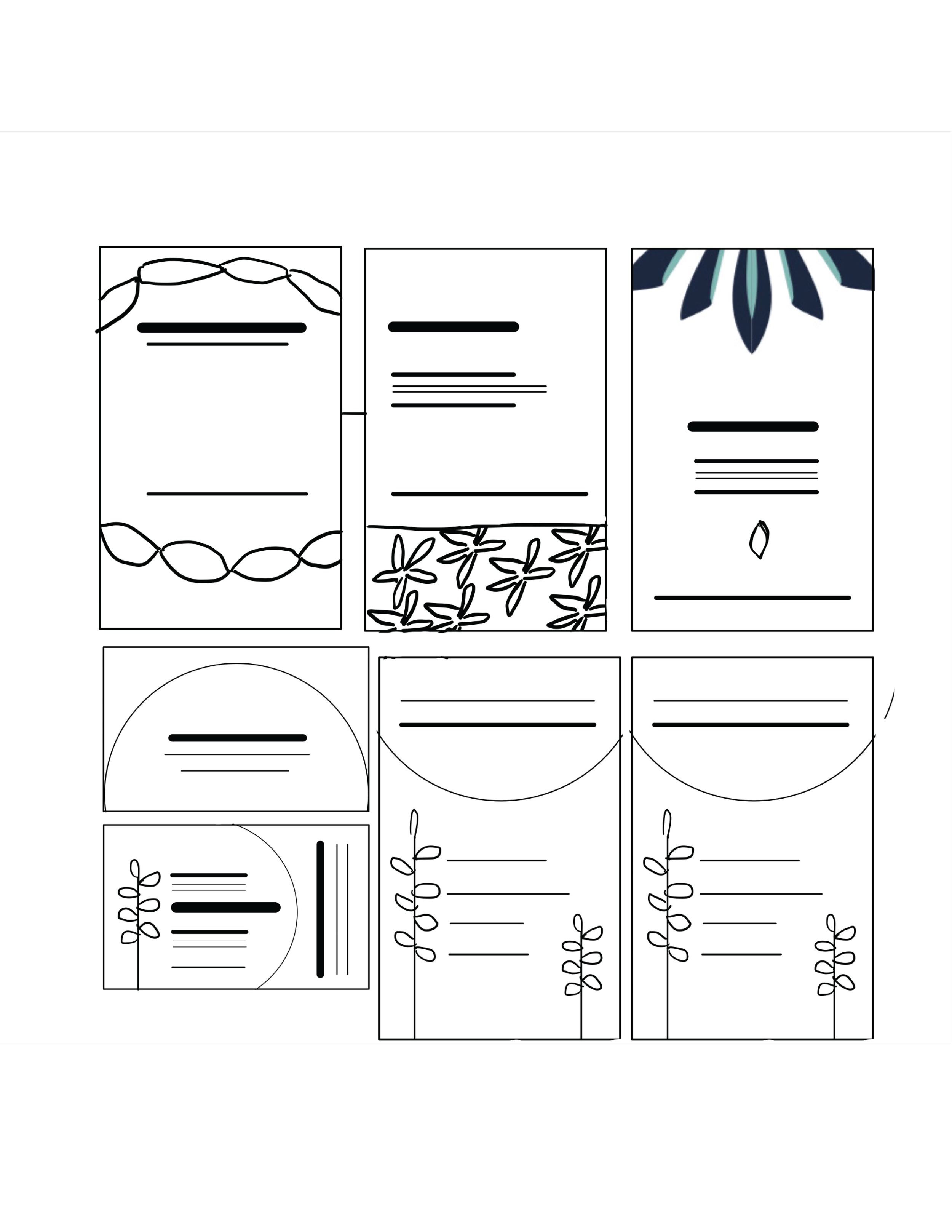
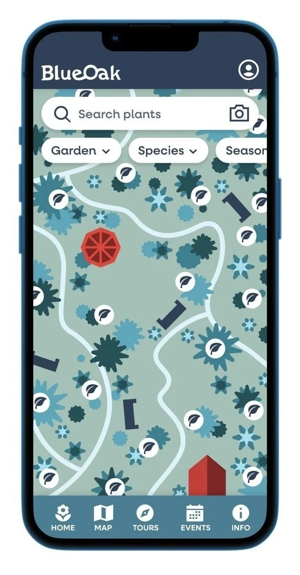
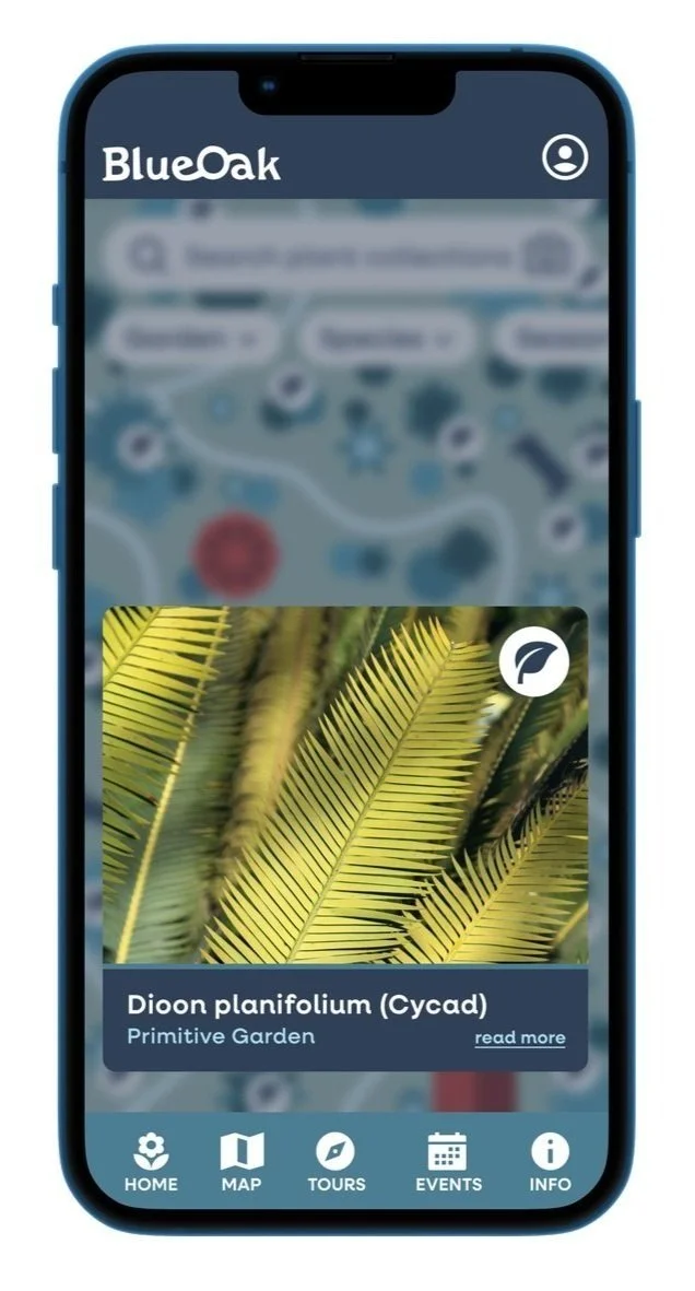
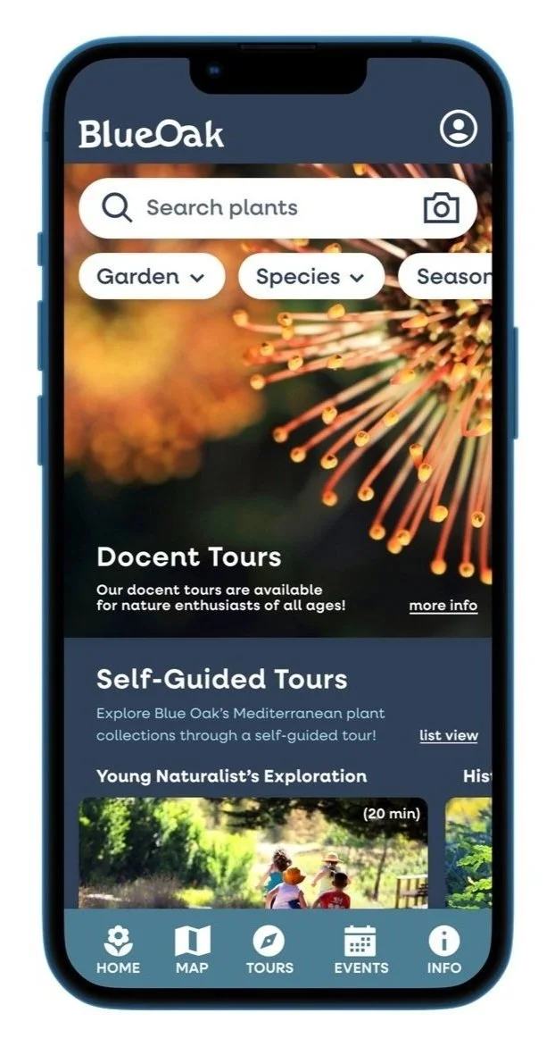
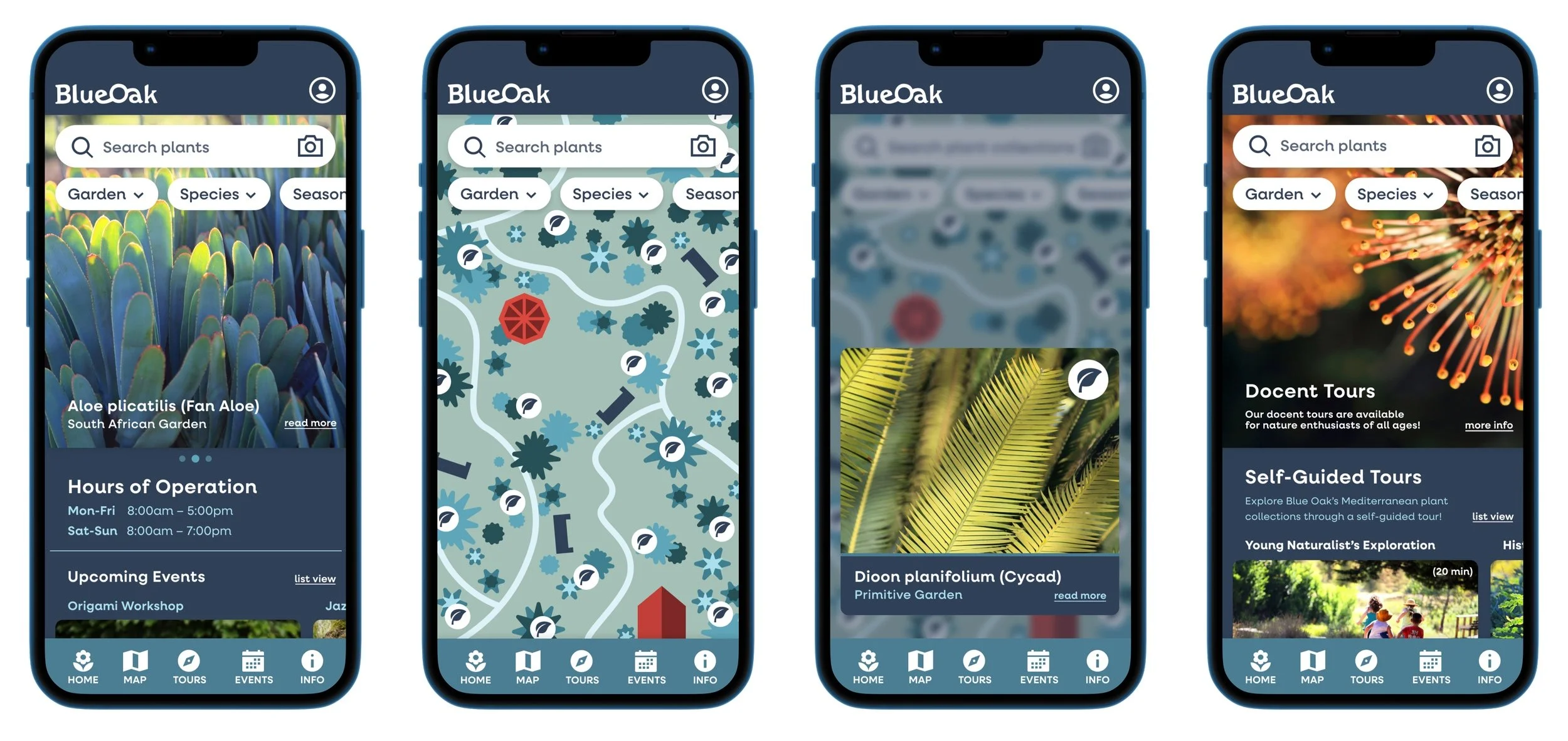
Mobile Application
I aimed to emulate the Memphis Group’s use of fun geometric connections while sketching ideas for how the chocolate shapes could interlock.
APP DESIGN

I aimed to emulate the Memphis Group’s use of fun geometric connections while sketching ideas for how the chocolate shapes could interlock.
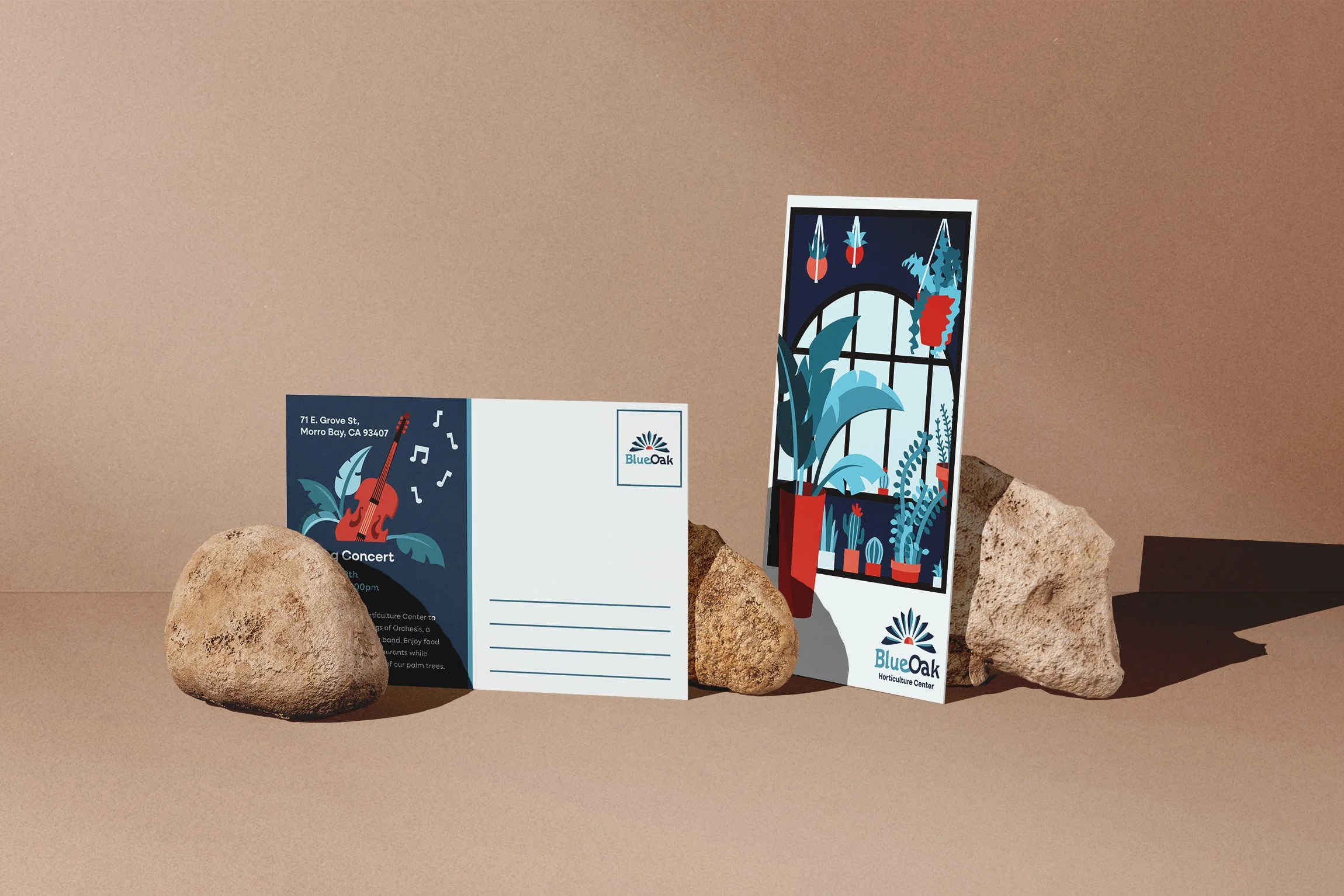
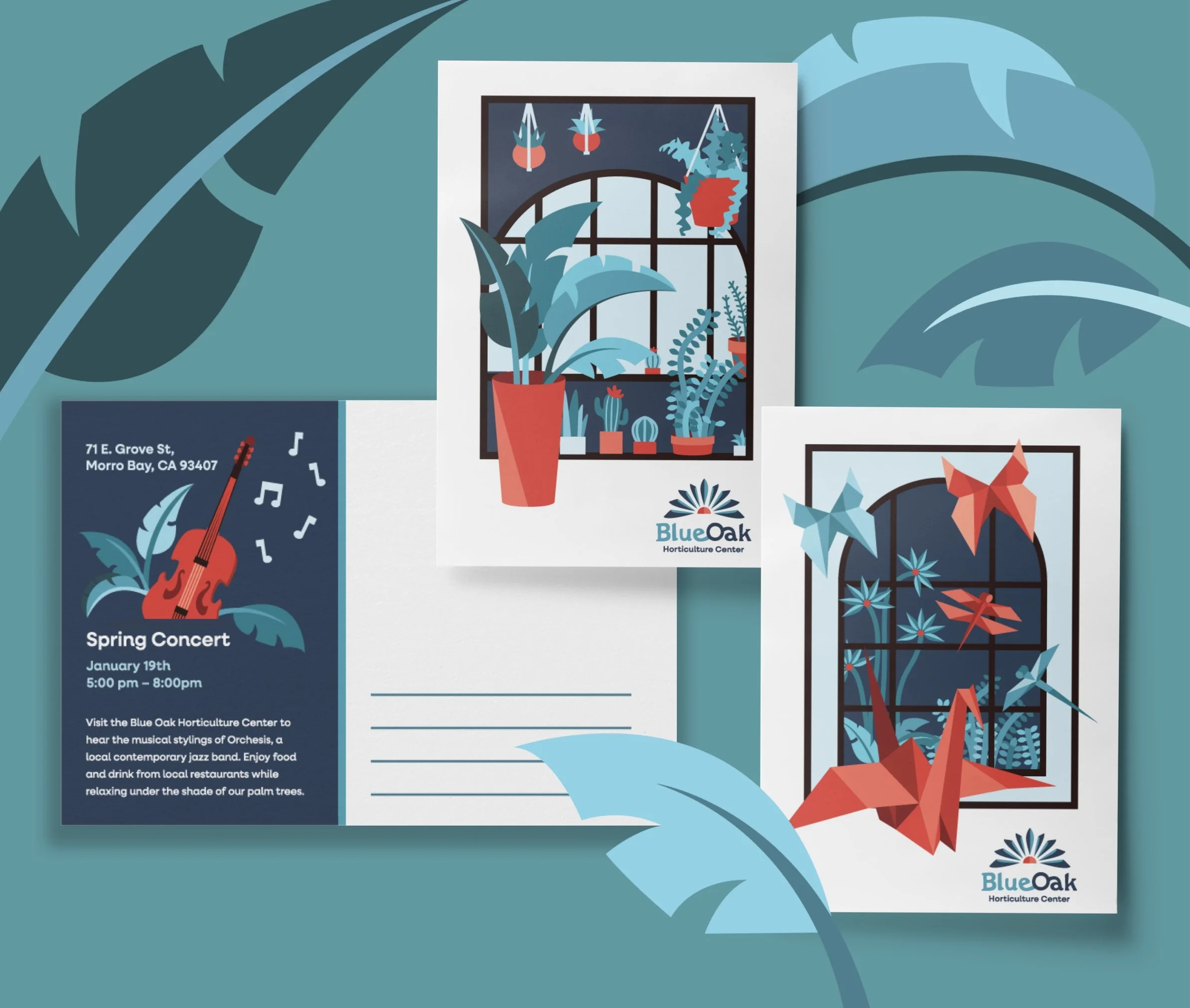
EVENT OUTREACH

I aimed to emulate the Memphis Group’s use of fun geometric connections while sketching ideas for how the chocolate shapes could interlock.
I aimed to emulate the Memphis Group’s use of fun geometric connections while sketching ideas for how the chocolate shapes could interlock.
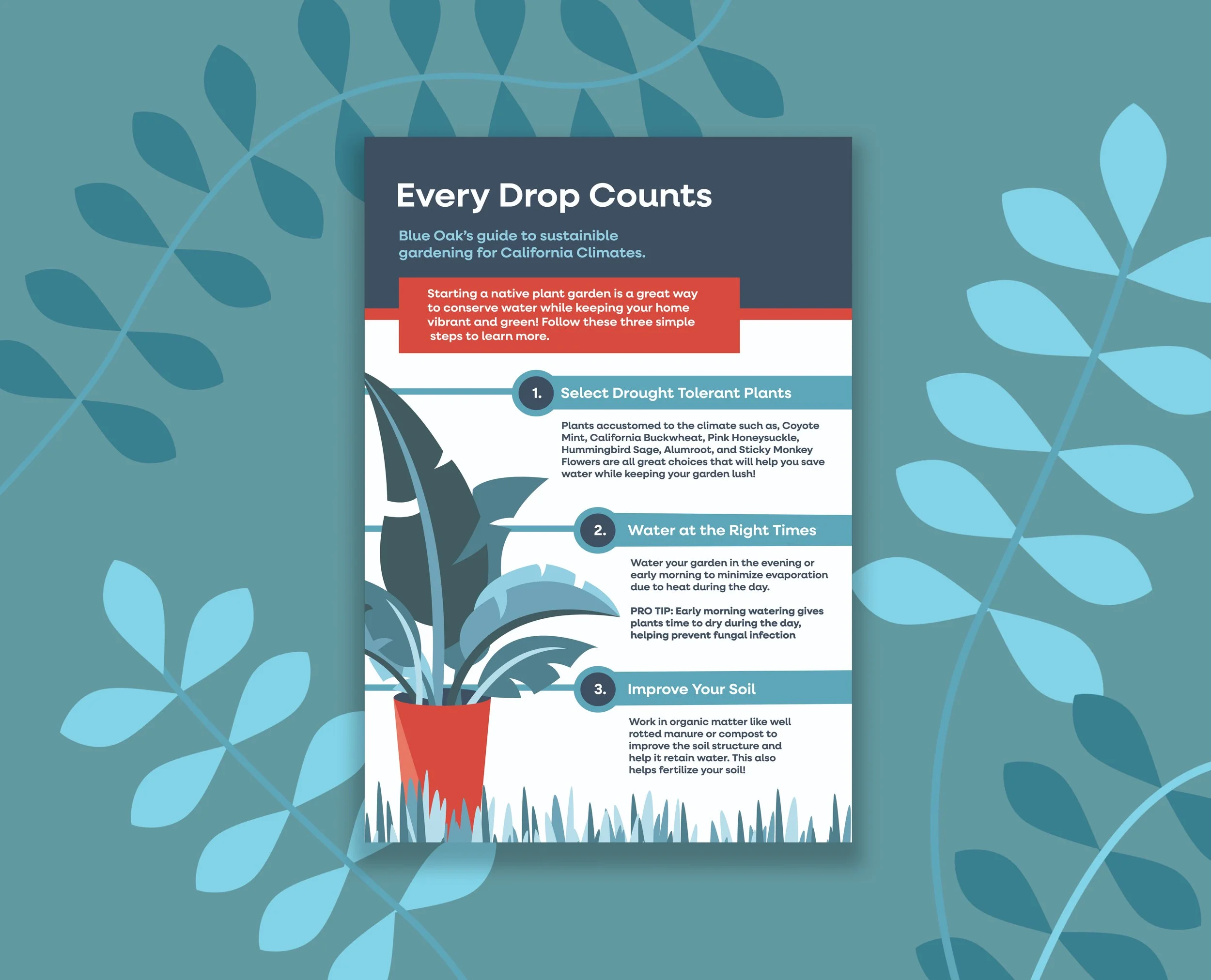
INFOGRAPHIC

Blue Oak
2023 | Brand Identity Project
Project Overview
This is a reimagined brand concept and accompanying design solution for The Leaning Pine Arboretum located in San Luis Obispo. I developed a comprehensive set of promotional materials, including a complete stationery set, event postcards, an eco-conscious infographic, and an interactive mobile app. I decided to rebrand the arboretum to the Blue Oak Horticulture Center because oak trees represent a significant feature of the center’s landscape and are native to the San Luis Valley. The change serves to benefit the arboretum by effectively expanding the accessibility to a greater audience of horticulture enthusiasts while clarifying the educational purpose of the gardens and specifying the existing plant collection with a more accurate name.
Team: Solo Project
Timeline: Fall 2023, 8 weeks design
Tools: Illustrator, Photoshop, InDesign, Figma
Disciplines: Branding Identity, User Experience, Marketing Strategy
Concept Sketches
My initial logo redesign sketches were derived from a study of the updated brand name and its letterforms. This process, helped me discover the visual motifs I wanted to incorporate into the final logotype design. The concept exploration demonstrates my process of developing the final branding solution for the Blue Oak logotype.
During the type and color study process, I played with fonts and palettes to cultivate a sense of peace and vibrant life through my logotype design. I selected colors inspired by the natural hues of the arboretum's plants and explored typography to complement the Blue Oak brand’s aesthetic.
Type & Color Studies

Final Logotype
The Blue Oak logotype identity incorporates the brand’s key concepts of connection, horticulture, and education through vibrant, turquoise and orange tones. “Blue Oak” is displayed in custom, lettering designed to convey connection, exploration, and discovery through the letterforms e, o, and a. The graphic symbol features outstretched, radial elements to emulate the pages of an open book while referencing the agave prevalent in the gardens.
Brand System Items
Blue Oak Mobile App
Event Postcards
Sustainable Gardening Infographic