
Career Services

Career Services
⟡
Helping Cal Poly students visualize graduate data and navigate personalized career paths
TIMELINE
TOOLS
4 weeks, 2024
Figjam
TEAM
Google Survey
Sophia Levin
Reva Mookly
SKILLS
Maxine Ancheta
User Research
Sameeha Siraj
Interaction Design
Nidi Sathish
Figma Prototyping
Sri Bala
Kaia Kim
PROJECT TASK
Figma
Redesign the Graduate Status Report to leverage graduate data analytics and provide Cal Poly students with personalized career path guidance, including insights into average salaries, top industries, professions, and companies relevant to their field of study.
GRADUATE STATUS REPORT (GSR)
Conducted by Career Services at Cal Poly, the GSR compiles data on the career outcomes of recent graduates. It offers insights into employment, graduate school admissions, and other career-related information to guide students’ career planning.
⟡
RESULTS
A user-friendly product that empowers students to confidently navigate their career paths by providing personalized insights to guide their career decisions. We addressed the findings from our user research by incorporating intuitive navigation, user-centered features, and tailored resources, including major-specific content and practical guidance on skill development for desired roles.

Career Services
2024 | Website Redesign for Client
Project Overview
Career Services came to Iter8, Cal Poly’s student-run product design agency, to find a way to leverage graduate data analytics to guide students through the job market, offering personalized career paths based on past student data. The website we designed provides insights into average salaries by major and concentration, top industries, professions, and companies relevant to their field of study, becoming an essential resource for students seeking clarity and guidance in their career journey.
Team: Reva Mookly, Sameeha Siraj, Sri Bala, Nidhi Sathish, Kaia Kim, Maxine Ancheta, and me!
Timeline: Winter 2024, 4 weeks
Tools: Figma
Disciplines: User Research, UX Design, Prototyping, Components, Variants
Client Background
Career Services at California Polytechnic State University (Cal Poly) supports students in exploring careers, choosing majors, and preparing for the job market.
Each year, they conduct a Graduate Status Report (GSR), which surveys recent grads to provide data on employment, salaries, and further education. This helps students make informed career decisions.

We began our design process by analyzing the previous Graduate Status Report design to identify user pain points where the design could be streamlined to create a more intuitive user experience.
Previous Design

Previous User Flow
Based on our review of the previous user flow and site design, our team identified three key pain points to address:
Unintuitive Navigation: Users struggled to easily access relevant sections due to a confusing layout and lack of clear pathways.
Limited Interactivity: The absence of interactive elements, like filters, restricted users' ability to explore and personalize the data effectively.
Lack of Clear Calls to Action: The previous design did not provide clear calls to action, leaving users uncertain about what to do after reviewing the information.
UX Research Process
Quantitative Research
To ensure the website met user needs, we conducted comprehensive user research by distributing a 10-question survey to Cal Poly students, including an option for additional comments.
Survey Insights
IInsights revealed key student priorities in career decision-making, as well as pain points found in the GSR report's current design.
Priorities in Career Decision-Making: Users identified role and salary as the two most important factors when choosing a career, followed by job location. In comparison, company culture, values, and skill requirements were ranked as less important.
GSR Pain Points: Users found the GSR overwhelming and too detailed, suggesting that it could be simplified for better clarity. Many students felt the report was disjointed and difficult to understand, with a lack of context for the data.
Design Preferences: Users expressed a preference for a streamlined, company-focused layout that showcases popular roles within companies for Cal Poly alumni. Additionally, users wanted clear, concise statistics and intuitive graphics that don’t overwhelm the user with excessive information.


Qualitative Research
We conducted 14 user interviews with Cal Poly students from diverse majors to explore the challenges they face in choosing a career, their decision-making process for selecting a major, and their feedback on the university’s career services.
Affinity Mapping Insights
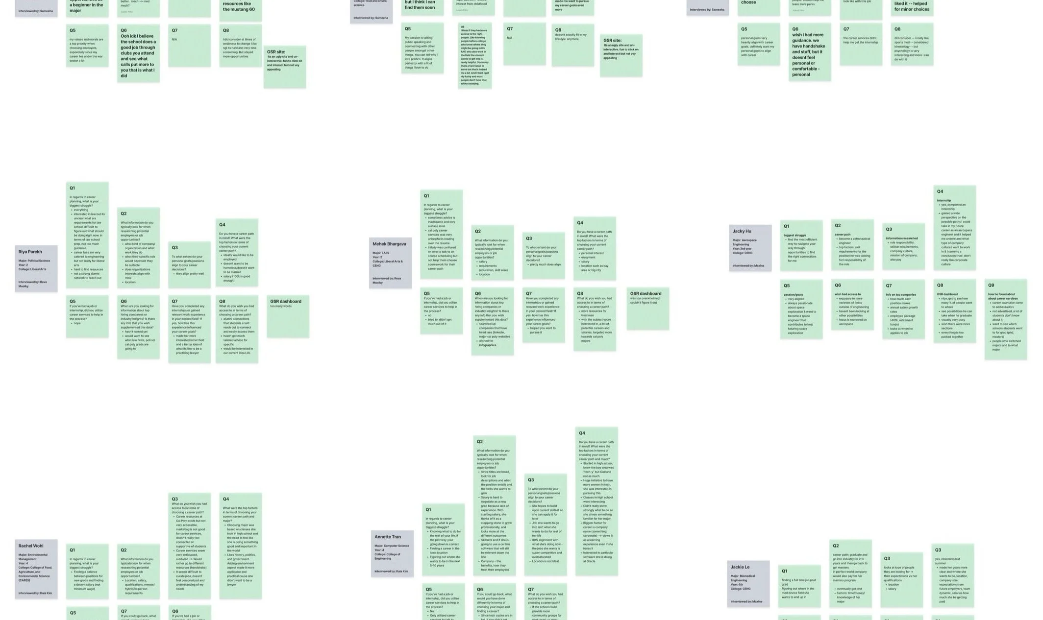

After organizing the interview insights into an affinity map, our team uncovered that students prioritize salary, personal interest, and enjoyment in their career decisions. We also discovered that students found the Graduation Status Report (GSR) overwhelming and disconnected. Students highlighted the need for career resources tailored to their major and practical guidance on developing the skills necessary for their desired roles.
The affinity map revealed key insights into students' needs and frustrations with the current career services interface. We used this feedback to create a webpage design that prioritizes intuitive navigation, user-centered features, and tailored resources to help students more effectively navigate their career paths.
UI Design Development
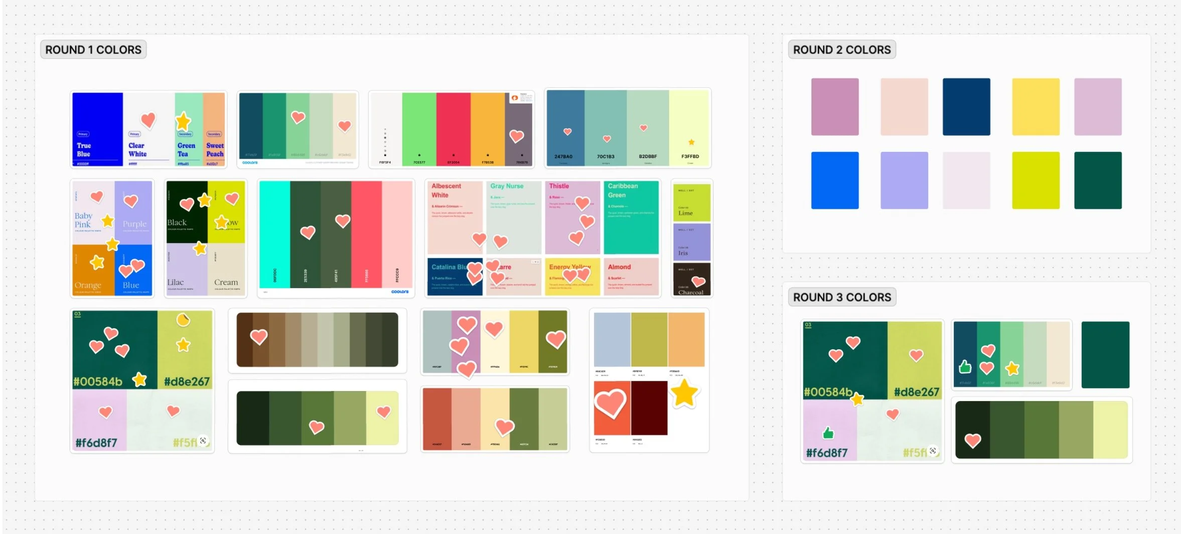
Color Moodboards
We created mood boards for color options, to achieve a professional look as requested by our client.
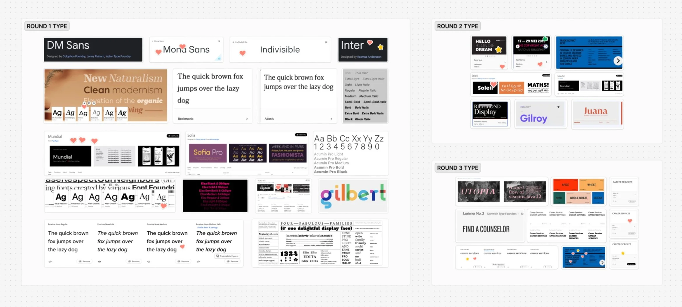
Type Moodboards
Next, we created type mood boards to explore various font pairings that would complement the signature Cal Poly fonts while maintaining a professional aesthetic.
Finalized Design System
We selected the font Indivisible for a clean, professional look, based on both the client's and students' design preferences. The color palette was built around Cal Poly's signature colors, ensuring brand consistency.

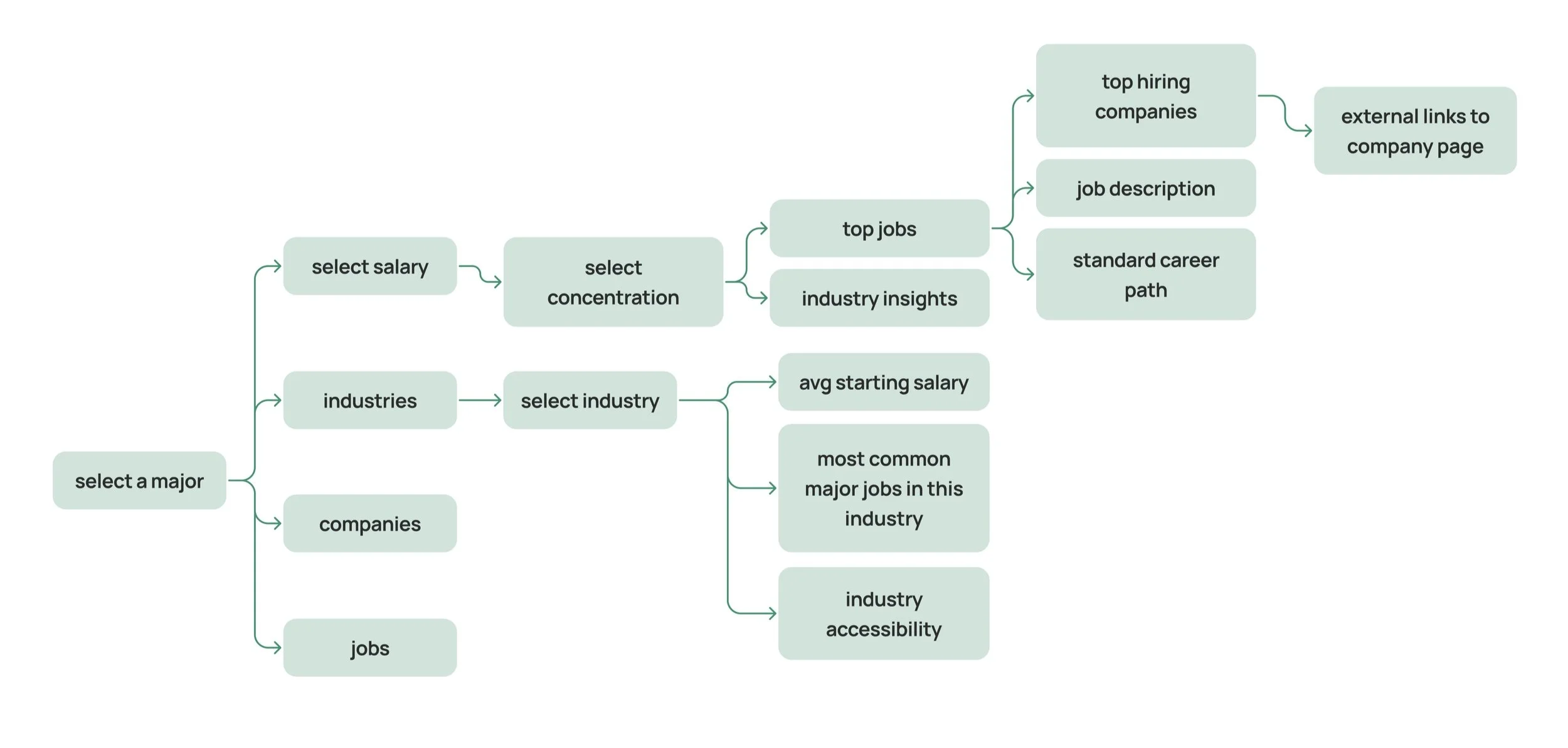
Low Fidelity Wireframes
I was tasked with designing the Career Navigator landing page, and the Major Overview page. In my initial lo-fi designs, I focused on incorporating the research insights from our UX studies.
For the Career Navigator page, I emphasized clear navigation to career resources, ensuring that students could easily access tailored guidance based on their major and concentration. In the Major Overview page, I prioritized displaying the top roles and their salaries to give students a clear idea of potential career paths and earning expectations.

Mid Fidelity Career Navigator
I created two mid-fidelity designs for the Career Navigator landing page. One included filters, a search bar, colleges, and top alumni employers, while the other excluded the top employers section. After consulting with the client, we decided the design without the alumni employers would be better, as that information would be more relevant on the personalized major pages.

Mid Fidelity Major Overview
For my Major Overview mid-fidelity design, I highlighted salaries, job positions, locations, and employers— the factors students identified as most important when considering their future career paths.

High Fidelity

Major Overview
Final Prototype
High Fidelity Designs
High Fidelity
